Website
250 Words "Feelings about the building"
250 Words "Discussing proposed changes"
10 Chosen Words
10 Chosen textures
Sketches
Redesigned model
Draft A1 panels
Tuesday, October 28, 2008
A1 Panels
The A1 panels turned out well, only problem i really had was just fitting enough information, so that i wouldn't overwhelm the reader. I did not use an interactive model in my PDFs because i rather have control over what is seen and not seen. I feel that i can easily just demonstrate the good points about my model instead of allowing someone else to look through the design and choose the good points for themselves.


Sunday, October 26, 2008
Progress till the final submission
So far i think i'm on track with what i want done for each day till the submission date. Though i am having a lot of trouble with modelling in sketchup because of the stairs. Though i am going to be sticking to using just google sketch up, because i can use vray with sketchup too. I may take it into 3ds max for a better render but i shall see. I understand as a student of architectural computing i should be learning to use an array of programs to complete my work, but i think i want to be able to grasp the idea of one program first and fully understand its capabilities. Looking at google sketchup i find many programs are pretty much similar to sketchup in terms of toolbar functions etc. So i realize that though i am using this fairly simple program, i can still learn from it and apply it to more complex programs like solidworks.
I have slowly began to refine my idea of the silkeborg in terms of how i am going to present it on the 3 A1 pdf's. My plan will be to address the structure itself, looking at room location and curvatures in the building and the play of light.
I have noticed in my model when i look at lighting and shadow, i can see how the open areas from the top how they light up the interior in specific spots in the museum. I believe this was Utzorns intention of using this natural spotlight feature, to convey the artwork. So that is where my design and poster will lead me into.
Saturday, October 25, 2008
Thoughts about the silkeborg redesign
After a long dicussion with Ross, it clarified so many things that i wanted and needed to know about Jorn Utzorn. Though it also opened a lot of doors into my approach of the Silkeborg design. One idea that i was really interested in was when Ross mentioned about the cargo ships, where Utzorn recieved his ideas from looking up in the middle of 2 cargo ship crates at the position of the light coming through. And also the idea of cave like structures also seem to present itself in the silkeborg plans. So i believe that with my redesign i want to be able to encapsulate the ideas of lighting, the surroundings and the feeling of caves.


The top of my Silkeborg design looks at using the idea of a maze. Have you ever been in a maze or in a cargo container hold, and walked around and the only light you see is the light coming from the top? that is where my ideas of the Silkeborg comes from. My Silkeborg above ground design looks at using that idea, by creating these walls that confuse people and also using thick glass in some sections to allow people down below to have small traces of natural light to shine through.
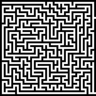
The top of my Silkeborg design looks at using the idea of a maze. Have you ever been in a maze or in a cargo container hold, and walked around and the only light you see is the light coming from the top? that is where my ideas of the Silkeborg comes from. My Silkeborg above ground design looks at using that idea, by creating these walls that confuse people and also using thick glass in some sections to allow people down below to have small traces of natural light to shine through.

Saturday, October 18, 2008


Wednesday, October 15, 2008
Silkeborg Model Draft 2
 The design using google sketch isn't going that well. The tools in google sketch don't allow me to make all the complex curves easily. Though i think that i will try to continue using this program as i have already started and i want to finish it off this way. If google sketch does become too much of a problem, i will transfer my design into 3ds max and continue the design.
250 words on my redesign
This part is going to be hard to decide how my model is going to be turning out. But i think my model will be leaning towards the styles of Frank Gehry because i believe that though Utzon does not consider Gehry as a true architect their styles even though different still lead to a similar result.
After having a long talk with Ross about my design and such. I have turned away from using Frank Gehry as a means of describing Utzorn's work. Talking to Ross made me understand the true meaning of how he calculated every aspect of his buildings. I find Utzorn's way of thinking to have great depths in it. I was amazed at how he could see past the objects visual feature and use its structure as a means of creating his architecture. for example the line structure of the leaves is what fueled one of his architectural designs. I find this way of thinking to be beyond the capabilities of most architects.
I feel that my design will be based on the original plans of the Silkeborg, but i will change/add a few features that i feel express his ideas of lighting and caves. I also have noticed that in some of Utzons buildings his palette of colour is very limited. That is why i feel it is a must to replicate this same idea into the redesign.


Awesome Website
I found a cool website for different Paver textures though only problem is that i don't know how to save the images. Only way i know is to screenshot and then alter the image in photoshop.
Texture Website
Texture Website
Redesign sketches
 This was found to be the right design path i want to take my Silkeborg museum to.
These designs were a possibility but i found that it did not really go along with Utzon's ideas.
Tuesday, October 14, 2008
250 word feelings on the building
My first thoughts of the Silkeborg Museum architectural plans reminds me of the "Walt Disney Concert Hall" in Los Angeles, USA. Utzon never saw or wanting his buildings to be related to Frank Gehry in any way because Utzon did not see Gehry as a true architect, because of Gehry's farfetched ideas. In saying that, it seems like Utzon's Silkeborg museum shares a similar structure to the Disney Concert Hall. Visually you would believe as an observer these two architects had similar ideas. Though in interviews and books with Jorn Utzon, he explains that his ideas are all mathematically thought out, he does not randomly "scrunch a piece of paper" and proclaim his new architectural piece. He looks into geometry to create all his different curves, each line was thought out carefully.


Though i find it interesting that Jorn Utzon came up with a building design that was totally different to the current architecture that was being produced in that time. Possibly if the building was built, he could of changed how architecture could be defined, as in that time architecture was considered mere rectangular objects.
"But the world of the curved form can give something that cannot ever be achieved by means of rectangular architecture."
When observing the Museum's plans and looking at interpretated physical models of the building. The sense of a maze comes to mind or this carnival fun house where nothing really is as it seems.

References
The Walt Disney Concert Hall, Los Angeles, USA Designed by Frank Gehry, 1989.
Wednesday, October 8, 2008

Silkeborg Model Steps
 My model of the Silkeborg museum is going to be designed using Sketchup, i know that sketchup does not have the same "power" as 3ds max or solidworks, but the program is simple to use and it gives a rough model of the model, which i believe resembles the unfinished architecture of Jorn Utzorn.
Wednesday, September 24, 2008


Jorn Utzon Reflects on the Silkeborg Museum
"The musuem, which lies in an old, well-stocked garden with a wing divided into bays, is designed so that it does not disturb the surroundings, but concentrates 100% on the interior. A building of several storeys above the ground would be like a bull in a china shop, and the respect for the existing calm wing of the museum calls for a solution that will not dominate the surroundings on account of its size.
"It feels natural to bury the museum in the ground to a depth corresponding to the height of a three-storeyed building and only to allow the upper part - the roof lights taking up one storey - to appear above the ground level.
"The design of this buried museum has a character rather like a cave or an oven. Because they are direct continuation of the walls of the museum, the visible one-storey roof lights suggest this cave-like character and clearly demonstrate the reason for their special design.
"In contrast to a square room, a cave has a distinct enclosed effect thanks to its natural shape without right angles. Continuous shapes such as we have in the museum express and emphasise the quadrilateral canvases and objects in the same powerful way that a cyclorama on a stage emphasises the individual characters and the flats.
"The floor, too, has been included in this continuous movement, and these dramatic shapes also correspond well with the idea of digging the museum out underground.
"The inspiration for the design of the museum comes from many different experiences -- including my visit to the caves in Tatung, west of Peking, where hundreds of Buddha sculptures and other figures are carved in caves in the rocks by the bank of the river. These sculptures appear in all shapes in contrast to or in harmony with the surrounding space. The caves are all of varying sizes and shapes and with varying illumination. The old Chinese sculptors haave experimented with all possibilities, and the most fantastic thing is a cave that is almost filled with a Buddha figure with c.7-metre-high face. Three platforms linked by ladders give the visitor the possibility of walking around and coming to close quarters with this gigantic figure.
"Here, in this museum, it is possible to exhibit paintings and sculptures the size of a three-storeyed building so that it is possible to walk around the objects on all levels on the system of ramps, and perhaps the possibility of this kind of exhibition leads to a new line of development in decorative art in place of the ordinary form in public buildings today, which are merely easel paintings on a gigantic scale.
"The various works of art can also be exhibited individually or in groups in every conceivable manner. It will also be possible in one of the large ovens to isolate a single large painting or sculpture that must be viewed on its own.
"The continuous space in the museum provides surprising background effects with varied light for paintings and sculpture - a background effect of the same infinite character as a cyclorama on a stage.
"The chimneys give the museum a clean, but varied roof light. The amount of light can be varied by means of blinds, and if it is so desired the roof light in the chimneys can be replaced with direct spotlight directed on a single object. The mullions supporting the roof lights are provided with suspension points so that they act like rigging loft in a theatre, so there will be the possibility of placing an object anywhere in the room.
"The light mainly falls in along the walls and on the floors without disturbing shadow effects at the corners, and the irritation element from the direct light from above is avoided.
"It will be with a sense of surprise and a desire to penetrate down into the building that the visitor for the first time sees the three-storeyed building open beneath him. Unconcerned - stairs and corridors which normally disturb - the viewer will glide almost effortlessly down into the museum via the ramp, taking him through the space.
"Strict geometry will form the basis for a simple constructional shape. The visible curved external surfaces are to be clad with ceramics in strong colours so that the parts of the building emerge like shining ceramic sculptures, and inside the museum will be kept in white.
"In the work with the curved shapes in the opera house, I have developed a great desire to go further with free architectural shapes, but at the same time to control the free shape with a geometry that makes it possible to construct the building from mass produced components. I am quite aware of the danger in the curved shapes in contrast to the relative safety of quadrilateral shapes. But the world of the curved form can give something that cannot ever be achieved by means of rectanglular architecture. The hulls of ships, caves and sculpture demonstrate this."
Wednesday, September 17, 2008
Mistake found in website
I forgot to title my webpage for the graphics section.
Another error is that, my webpage does not seem to work well in iexplorer. Though works fine in firefox.
Another error is that, my webpage does not seem to work well in iexplorer. Though works fine in firefox.
Tuesday, September 16, 2008
Website Link and final thoughts
Nakagin Capsule Tower Website Link
http://users.tpg.com.au/lamcube/DannyARCH1390
My final thoughts of my website is that the layout and features on the website are meant to intrigue viewers to continue to browse the site, i tried to make the site as easy to understand as possible, so that anyone could access the website and find it useful. The site overall was simple yet eye-catching, i believe that this best represents the ideas of the Japanese culture.
My backdrop animation brings the idea of small space communities into the viewers thoughts, it is also an interesting feature of the site. Though this website is suppose to be a fairly professional website, i tried to incorporate the ideas and culture of Japan. Japan can be seen as this society that is leading the path to new technological advances, though as a society they enjoy dwelling on this "fantasy and magical world". That is why in regards to the backdrop i tried to incorporate this hilarious and interesting feature to my website.
Not having been able to find any other resources other than the internet to back up my research, i feel my website lacks the quality in information. Yet i also feel that i have enough information for people to at least acknowledge what the purpose of the building is for and how unique the structure is.
I found the most difficult part when creating my website was to make suitable pop up boxes for when the viewer clicks on the images. Also the coding was long and confusing because i was using flv video files which show a lot of coding.
Monday, September 15, 2008
Website precedent study
In regards to my website design, i tried to make it simple as to represent the idea of this close community in the capsule tower (reminds me of a beehive). The structure of the tower isn't complicated, it uses simple shapes as a means of construction.
Ross had shown me in earlier weeks, of an architect's website, 'Jean Nouvel' http://www.jeannouvel.com/ . The website was simple and elegant, which lead me to try and imitate that idea into my own website.
Though i wanted to go in that direction, i felt i would alter my own design to incorporate my own feelings into the design. Which is why i chose to merge together a series of rectangular shape objects as a backdrop to my website.
My website is simple and uses a dominant black and white colour. Yet it also merges together this "fun and wacky" side with the use of the backdrop animation.
Sunday, September 14, 2008
Website layout and designs
These are just a few website layouts i was thinking of doing. It was hard to really incorporate all my ideas into a website. But i ended up trying to go for a simple yet appealing look.


Though it may look like a lot of scribbles, this was the draft of my website, showing each space and pixel dimension.


Though it may look like a lot of scribbles, this was the draft of my website, showing each space and pixel dimension.
Wednesday, September 10, 2008
Library Research
The books that were on shelf that talked about Kisho Kurokawa did not supply me with any information about the "Nakagin Capsule Tower", there were a few other books under Kurokawa's name, but they were already on loan till the 25th of September 2008.
Monday, September 8, 2008
SketchUp Designs
Note: The capsules of the model was originally taken from another designer i found on the internet. Though the rest of the whole Nakagin Capsule tower model was designed by me.
Nakagin Capsule Tower Draft Screenshots:


Nakagin Capsule Tower Draft Screenshots:


The capsule itself (Dimensions: 2.5m x 4m x 2.5m):
Subscribe to:
Comments (Atom)